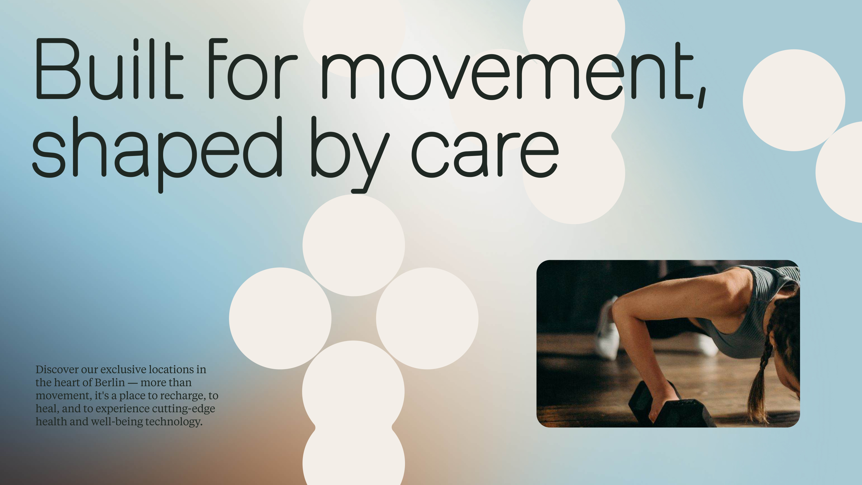
Umane is a holistic wellness space in Berlin: exclusive locations for movement, recovery, and cutting-edge health technology, guided by top specialists and personalised programs. A modern performance system built for ambition, driven by purpose — more than a gym, a place to recharge, to heal, to transform.
MoreSleep led the complete project: naming rationale, brand strategy, narrative, visual identity, typography system, colour palette, gradient language, texture system, art direction, motion principles, and a full design system. From first strategic brief to final brand board.
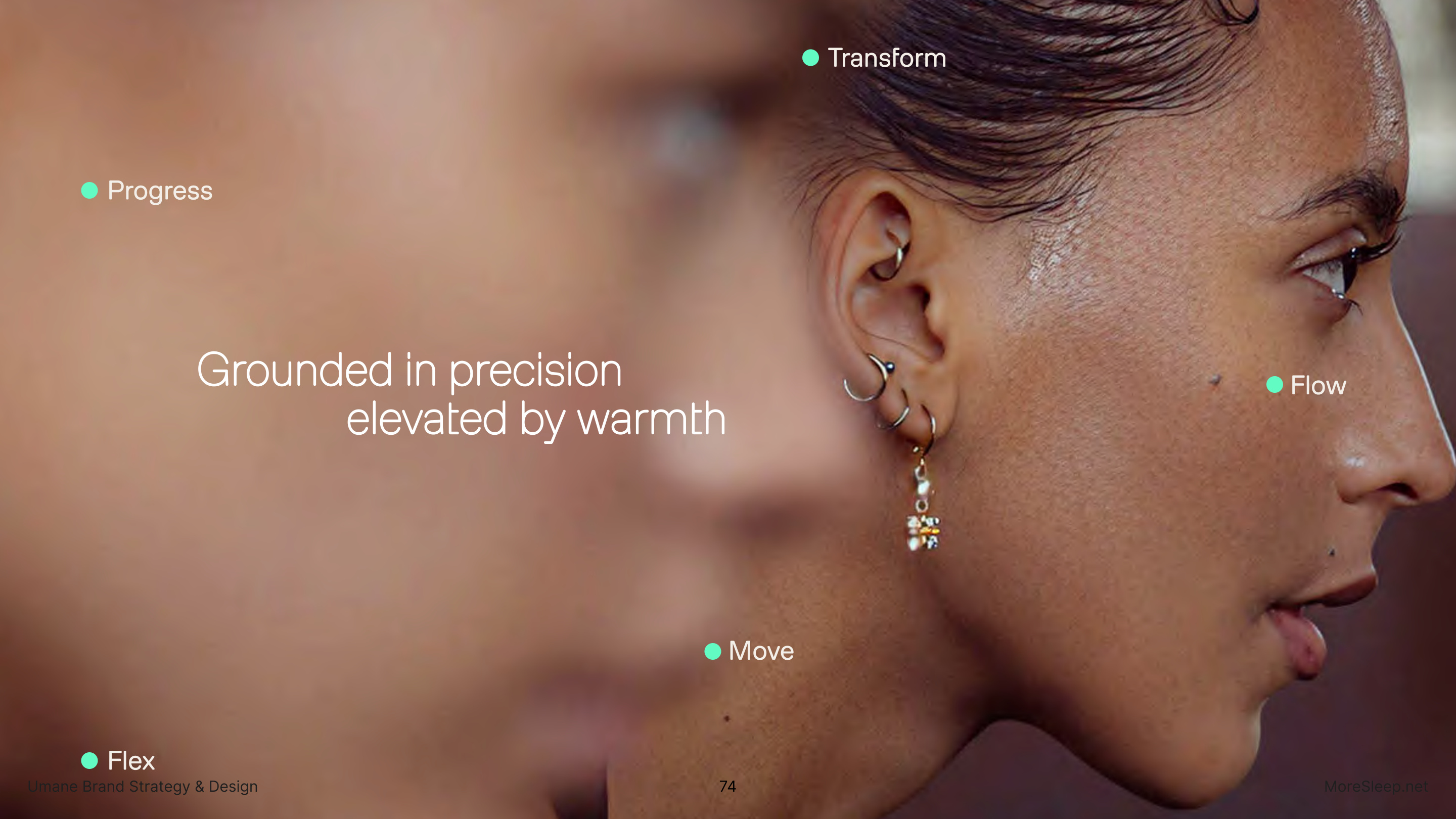
The strategic foundation rests on six pillars, with Capability as Culture at its centre. Umane doesn't sell better workouts — it builds a culture that lives better. The brand redefines performance: from pressure to presence, from competition to care, from hustle to real capability. Science, design, and humanity made visible in everything built.
This is the first MoreSleep project developed entirely in collaboration with Claude — not as an execution tool but as a thinking partner from day one. Strategy, naming rationale, brand pillars, tone of voice, design system logic, art direction: all iterated in conversation, decisions pressure-tested against the brand's own logic in real time. The deliverable came in two layers: a human-facing system (identity, guidelines, this case study) and a structured brand system — YAML and Markdown files defining positioning, voice, and visual tokens — readable by both people and agents. Same brand, two formats. Built for how teams actually work today.
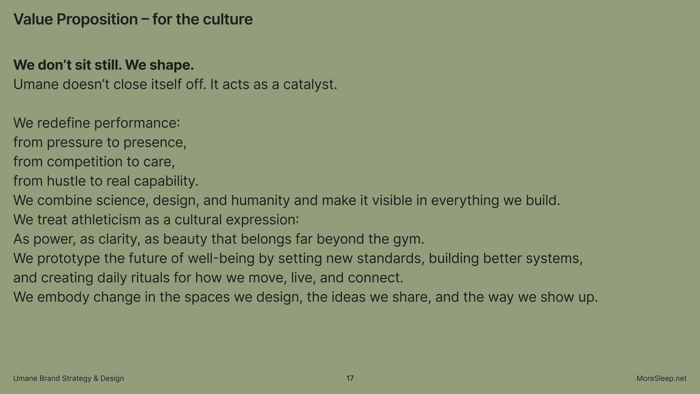
We don't sit still. We shape.
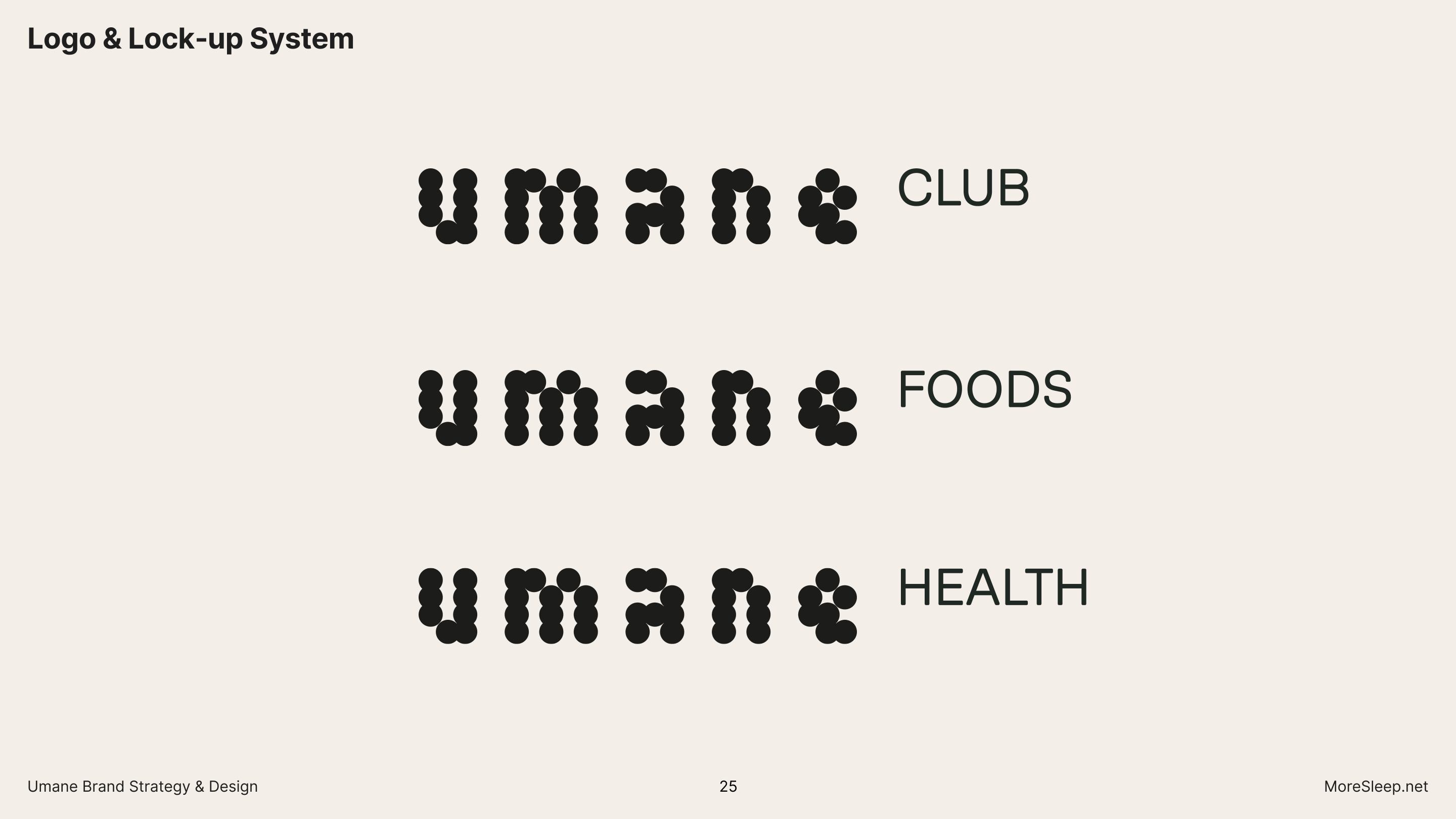
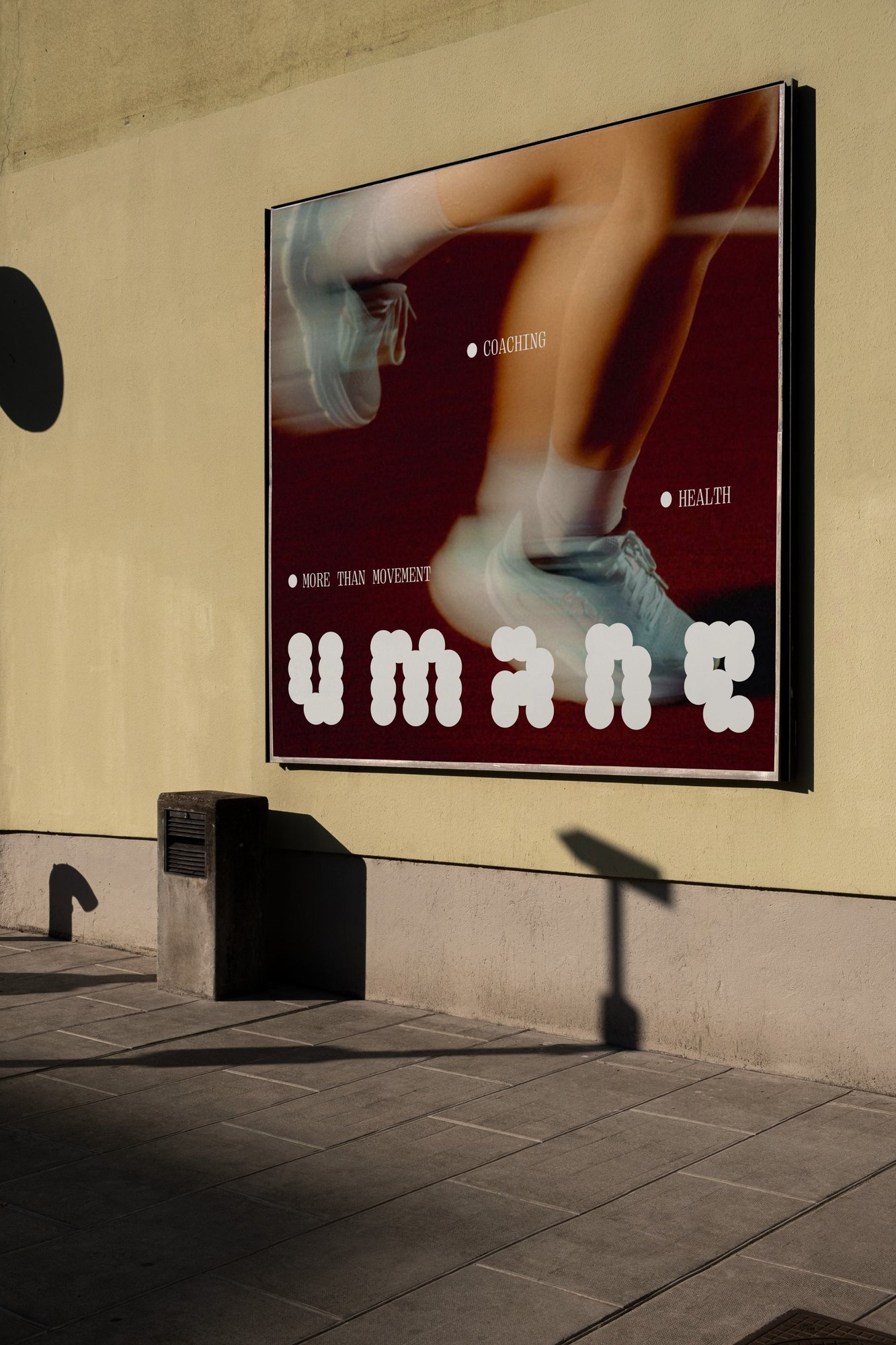
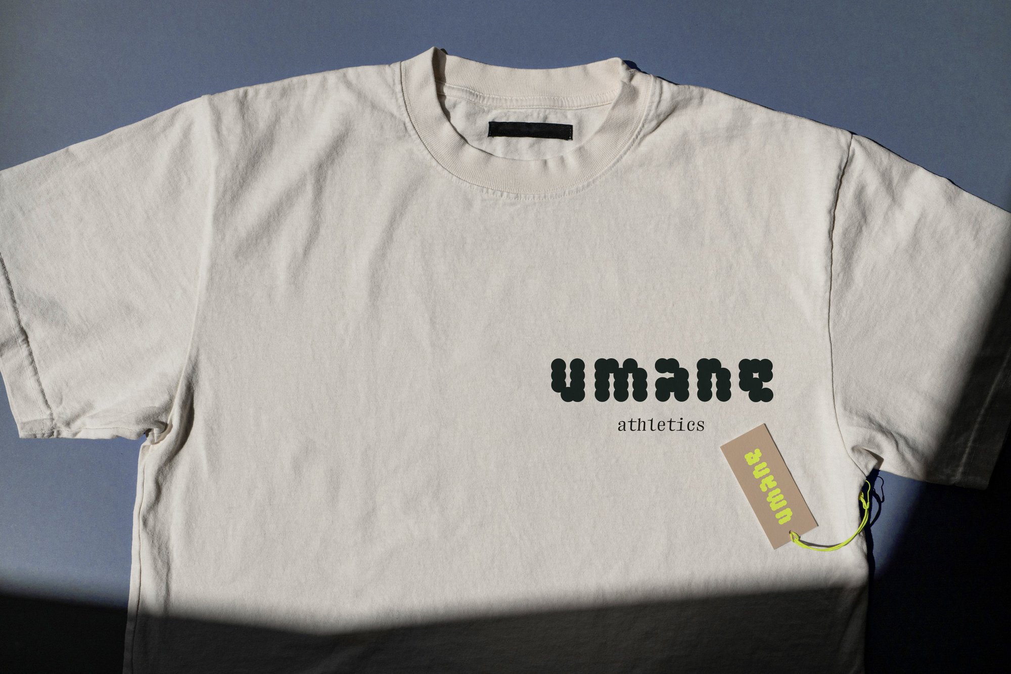
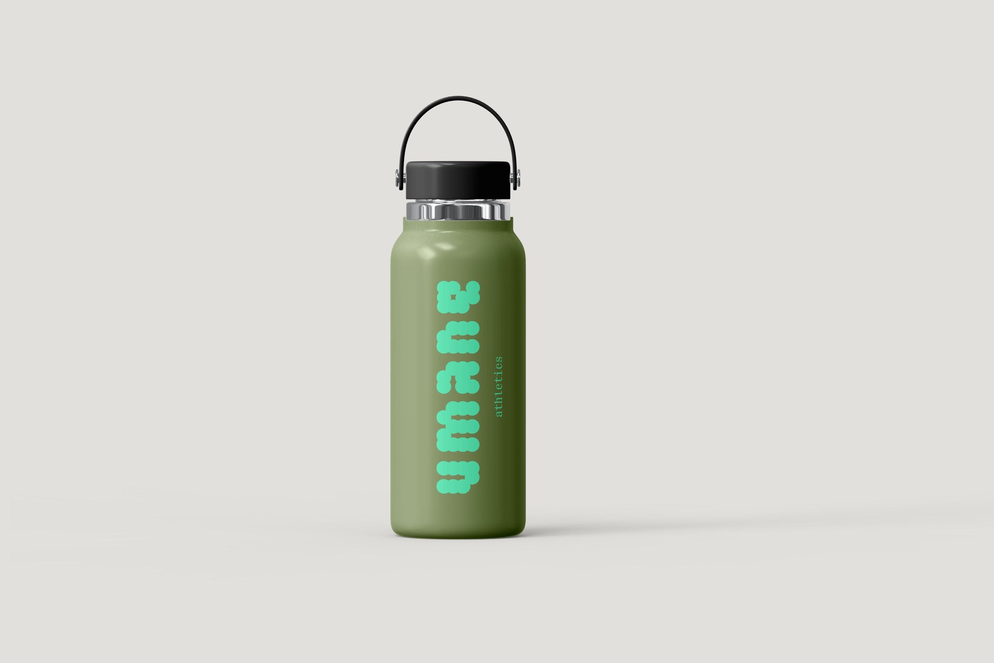
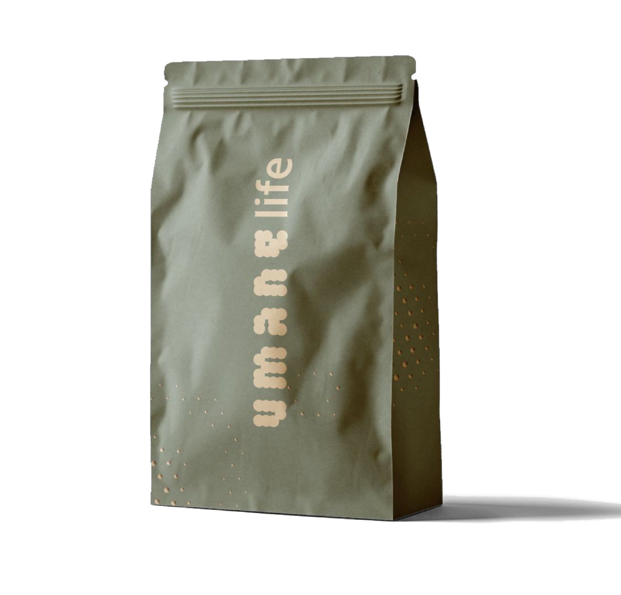
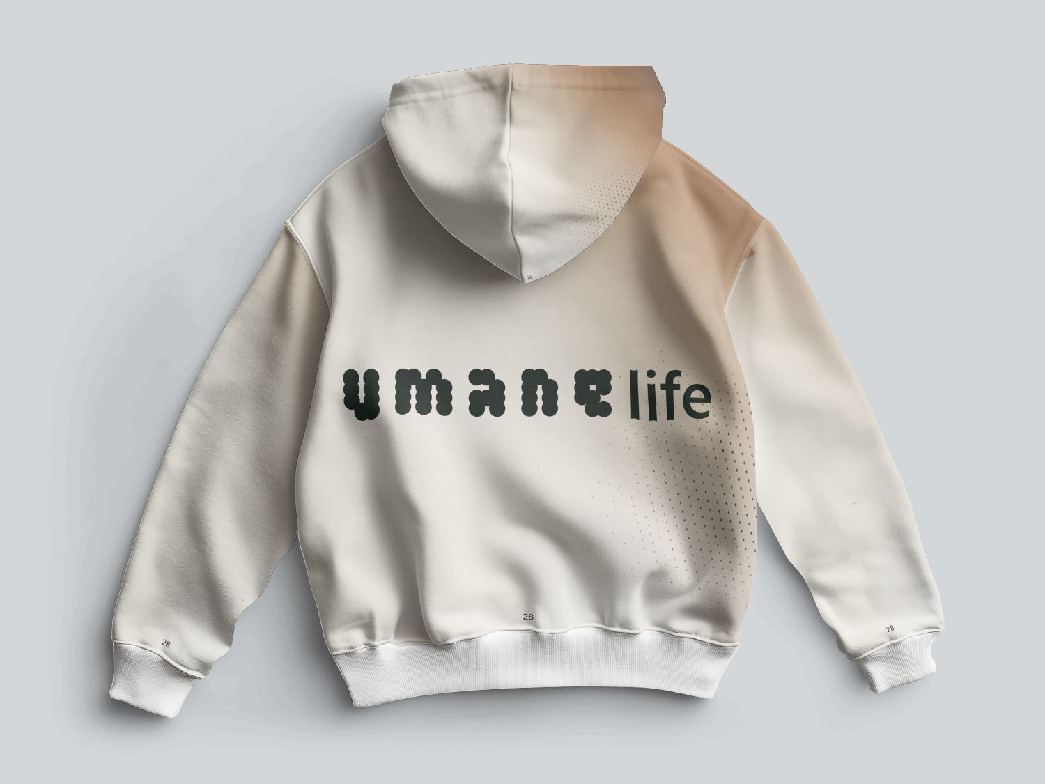
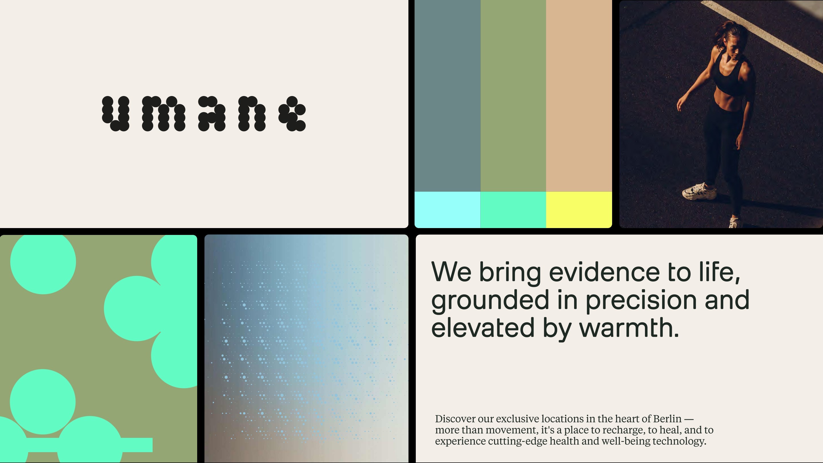
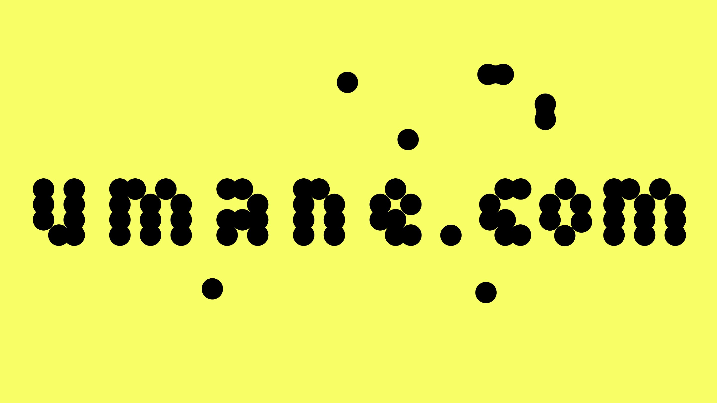
The Umane logo is the visual cornerstone of the identity: each letterform constructed from overlapping circles, echoing the brand's core forms — the human body in motion, the dot pattern system, the gradient language. A lock-up system extends the wordmark across sub-brands: Club, Foods, Health, Coach — each sharing the same modular logic.
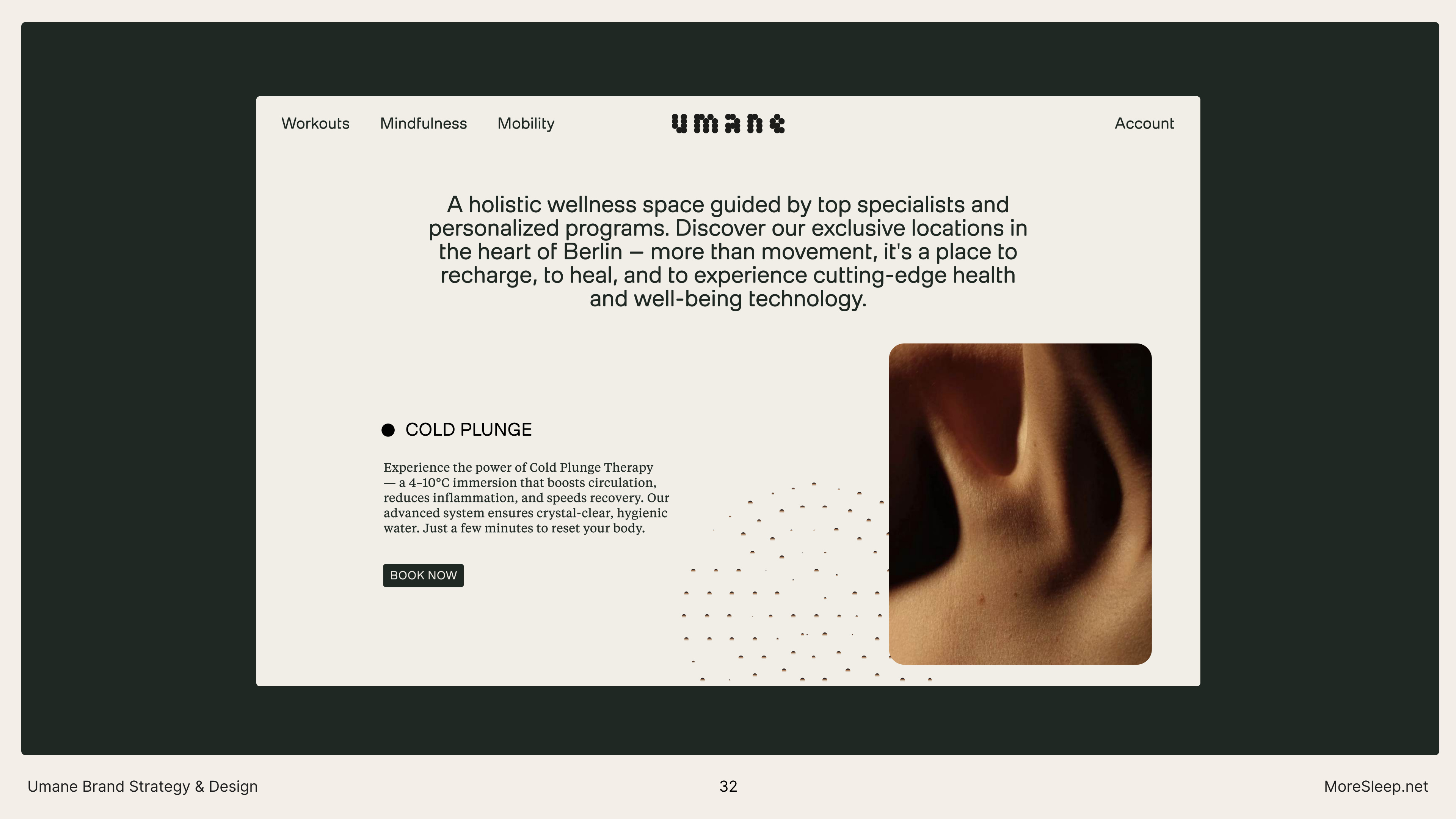
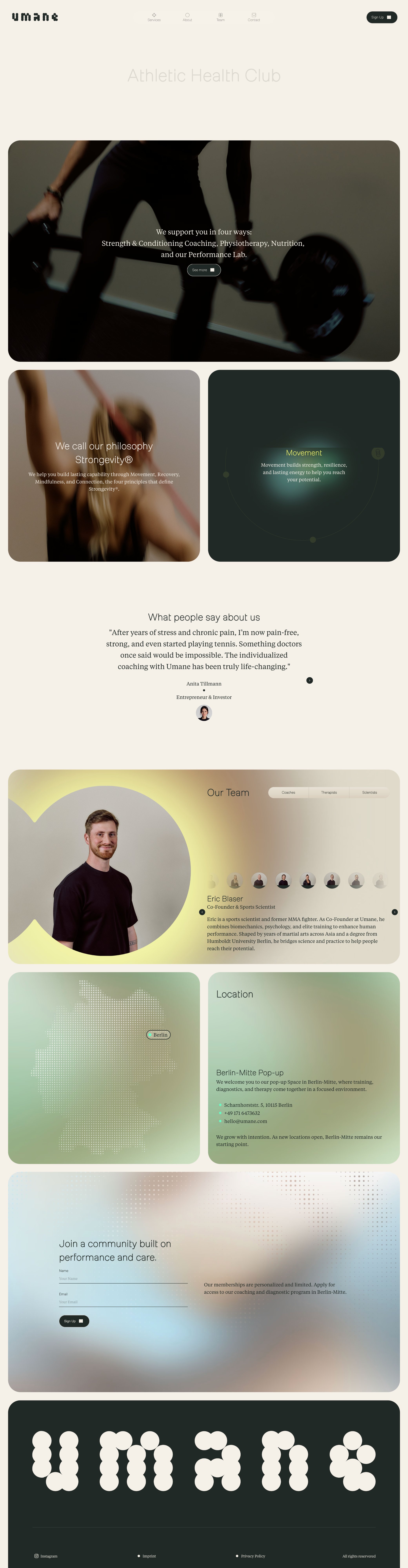
Milling Duplex brings geometric precision to headlines. Tiempos brings warmth and clarity to body copy. Together they reflect the brand's duality: evidence-based and human-centred. The type system plays with scale, weight, and contrast — from cinematic single-word statements to dense editorial body text.
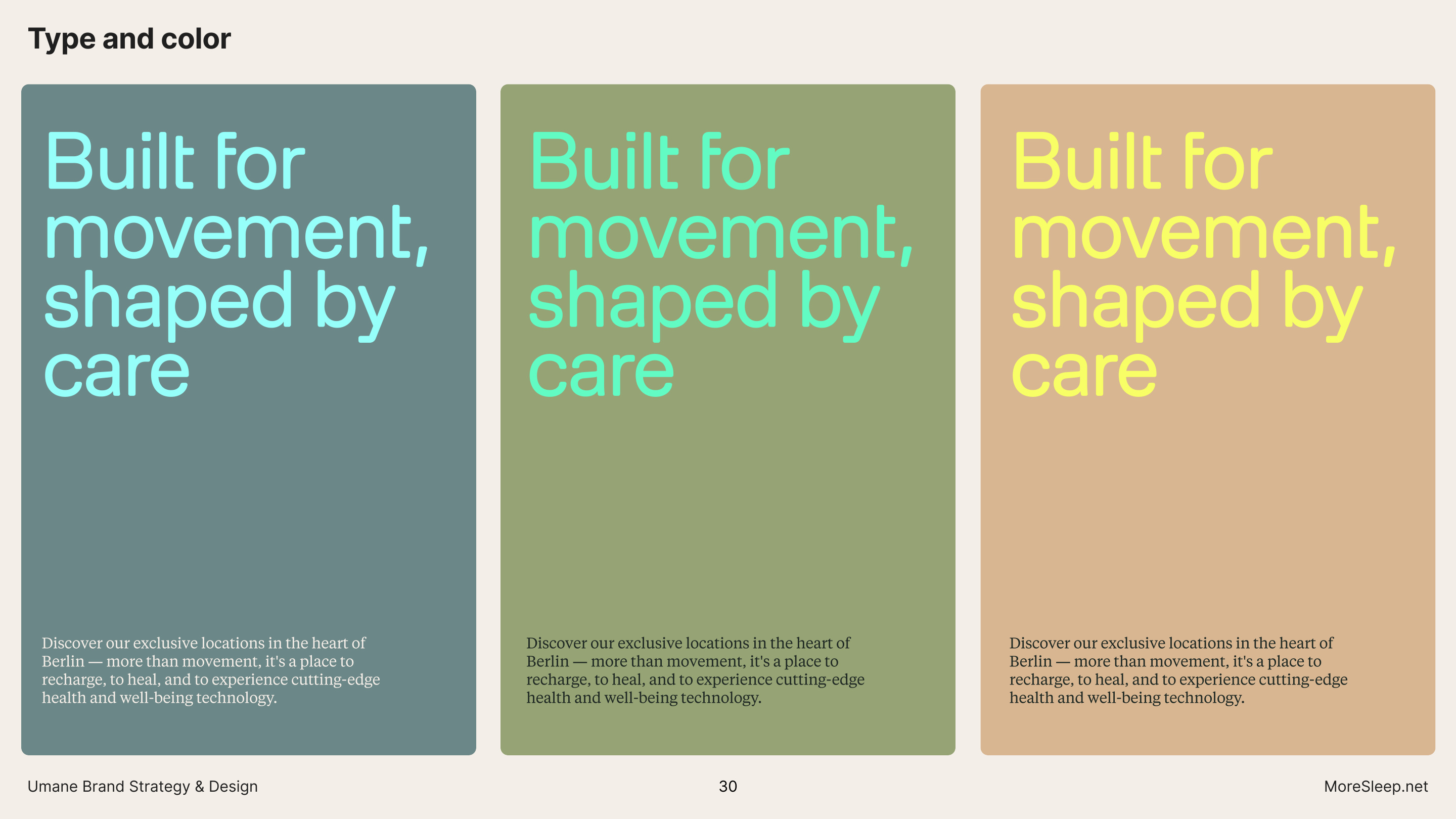
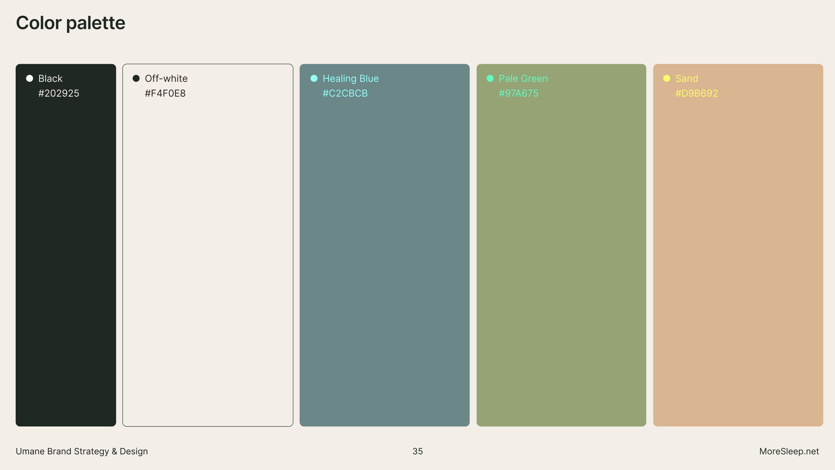
Color is restrained with neutral foundations punctuated by thoughtful accents. Soft backgrounds create calm and healing. Energetic contrasts in cyan, mint, and yellow motivate and activate. Every palette decision serves both the body and the mind.
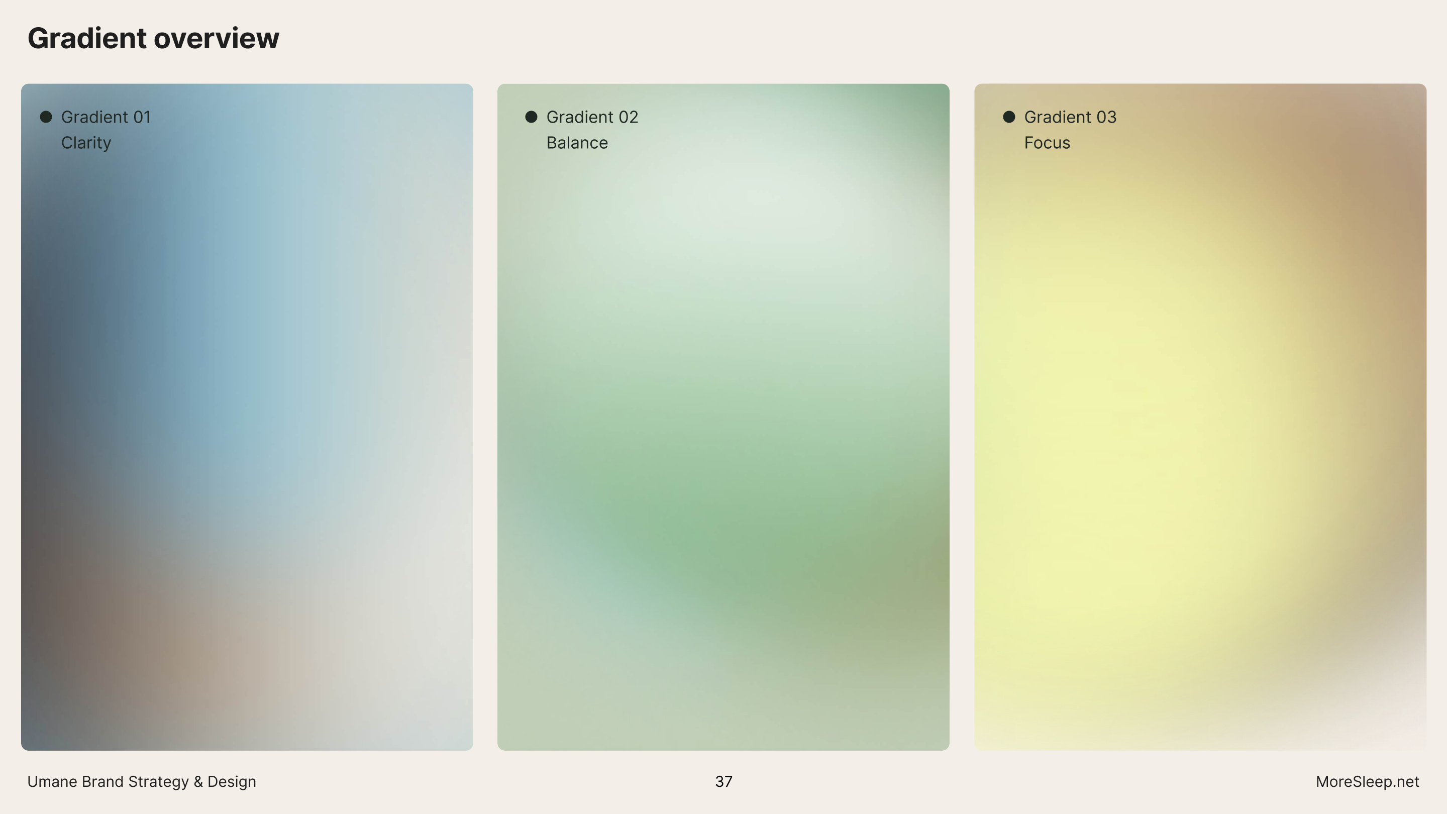
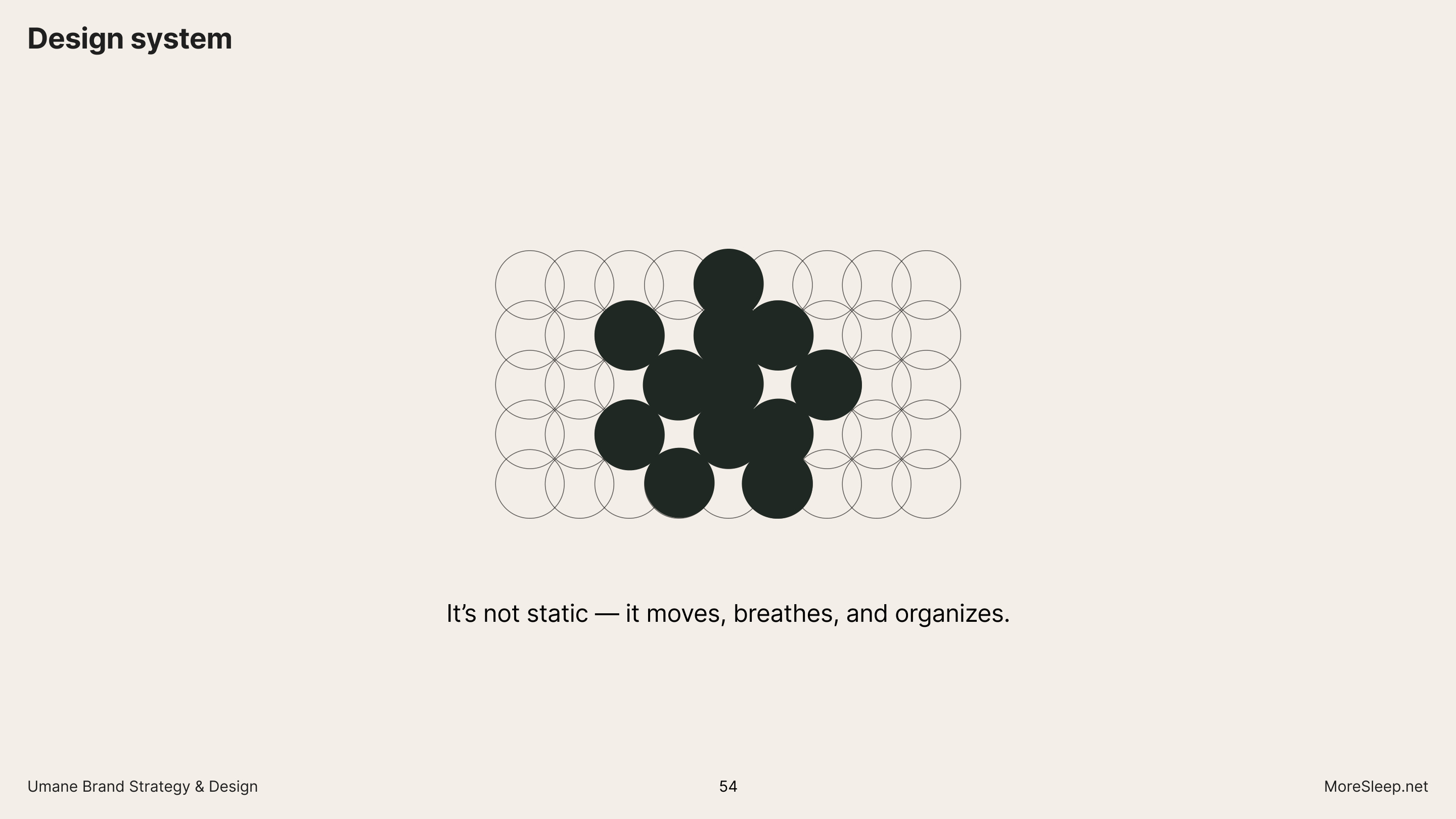
Logo grid, marker shapes, gradient language, dot texture — one unified toolkit. Applied across web, app, social, and print. The system is modular: it moves, breathes, and organises. Designed not to impress, but to resonate. Every element intentional, every application systematic.
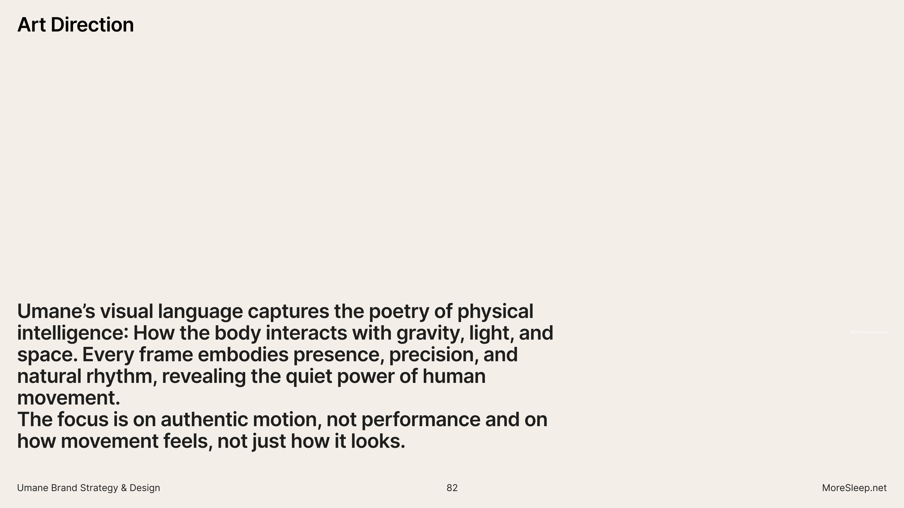
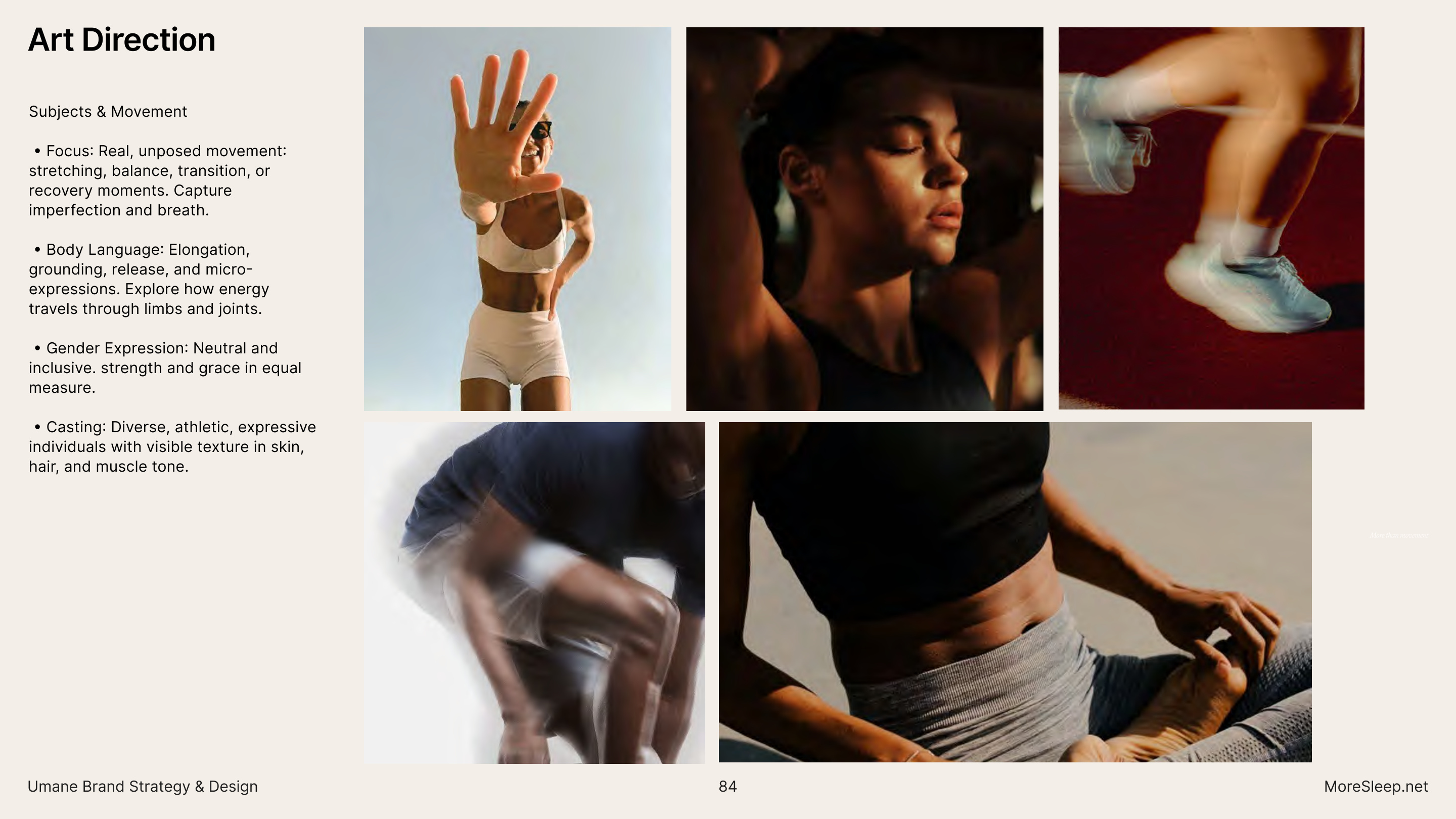
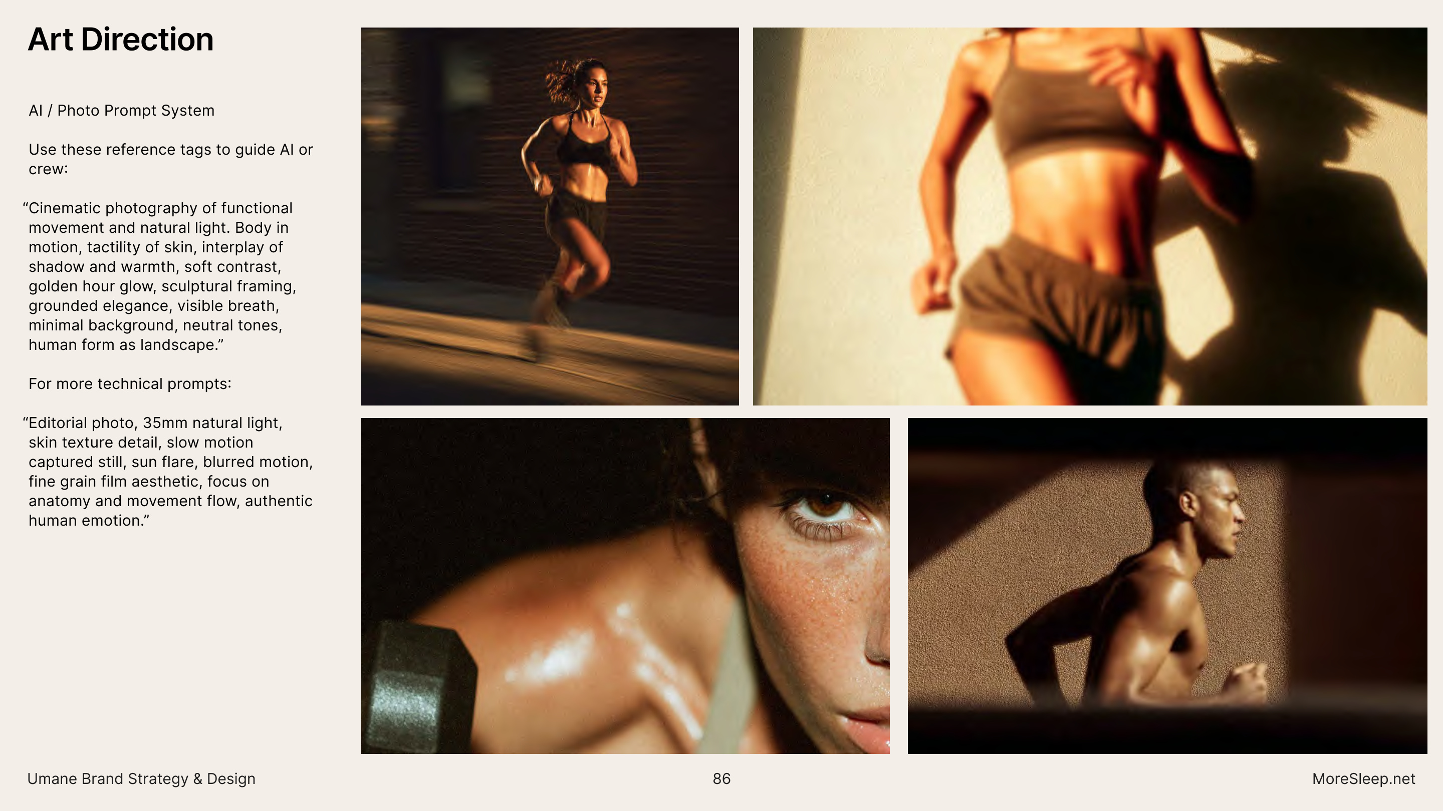
Umane's visual language captures how the body interacts with gravity, light, and space. Every frame embodies presence, precision, and natural rhythm, revealing the quiet power of human movement. The focus is on authentic motion, not performance — on how movement feels, not just how it looks. Matte textures, monochrome, natural fibers. Studios with character. The body as landscape.
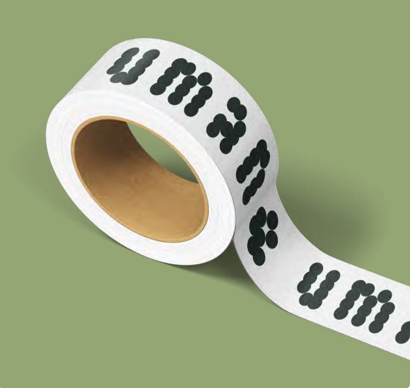
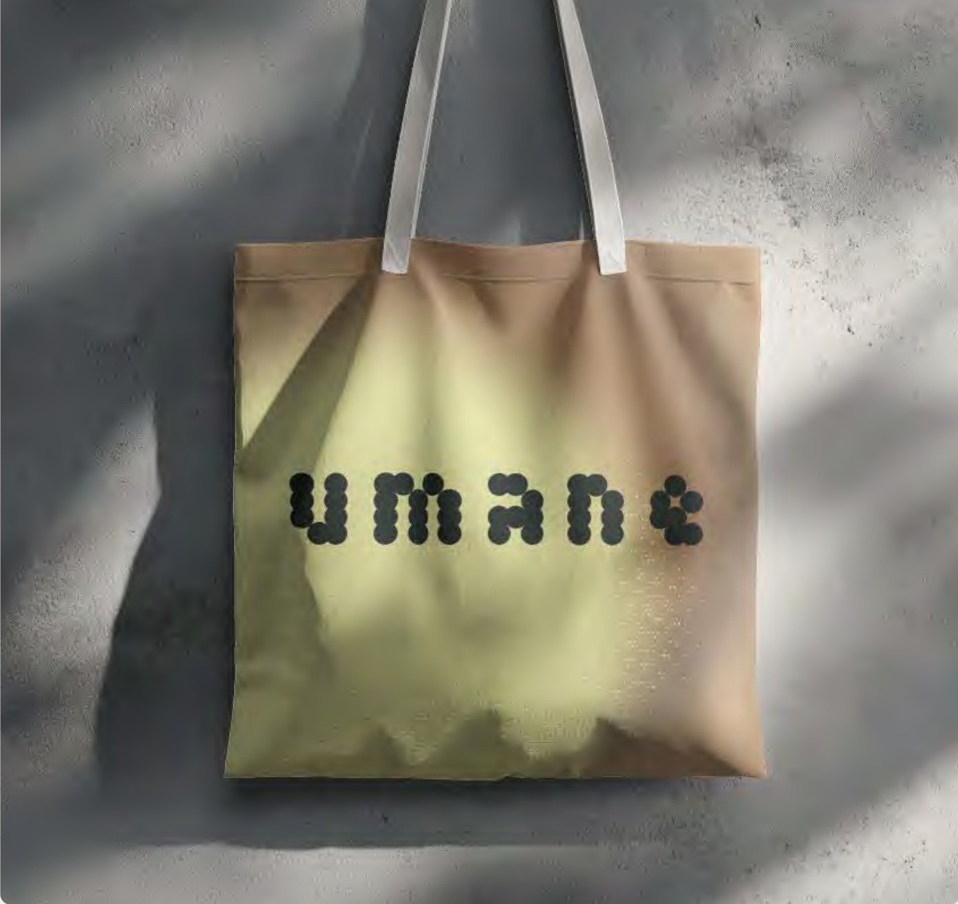
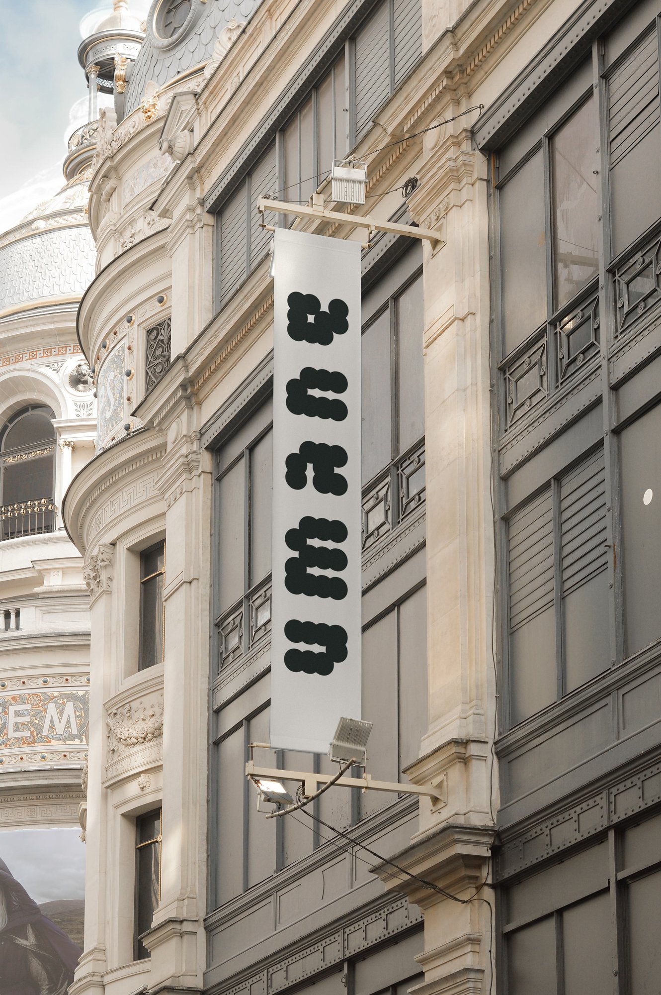
From supplement tins and sachets to washi tape and tote bags, social content to digital UI — the identity system scales across every touchpoint without losing its logic. Each application demonstrates the same modular thinking: the circle, the wordmark, the gradient, the dot. Different surface, same brand.
The website carries the full identity system into a working digital product — wordmark, type hierarchy, gradient language, dot texture, and marker system all translated into layout and interaction. Built on Framer, the site applies the brand's restraint: editorial hierarchy, minimal UI, the body as the primary visual. Strength & Conditioning, Physiotherapy, Nutrition, Performance Lab — a product ecosystem built on rhythm, clarity, and capability.
Capability, calibrated.
Umane is a holistic wellness club in Berlin. MoreSleep led the full project from strategy through design system: brand positioning, naming rationale, six strategic pillars, tone of voice, visual identity (logo, lock-up system), typography (Milling Duplex + Tiempos), colour palette, gradient system, texture language, art direction, motion principles, and applications across digital, social, and print.
The visual language is built on balance: clarity and character, structure and softness. Every element modular and intentional, the result a visual identity that feels intelligent, grounded, and quietly aspirational — a direct reflection of the brand's promise: capability, calibrated.