
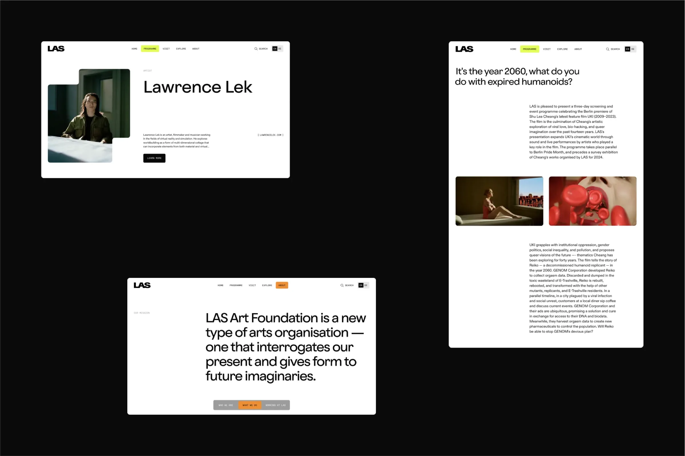
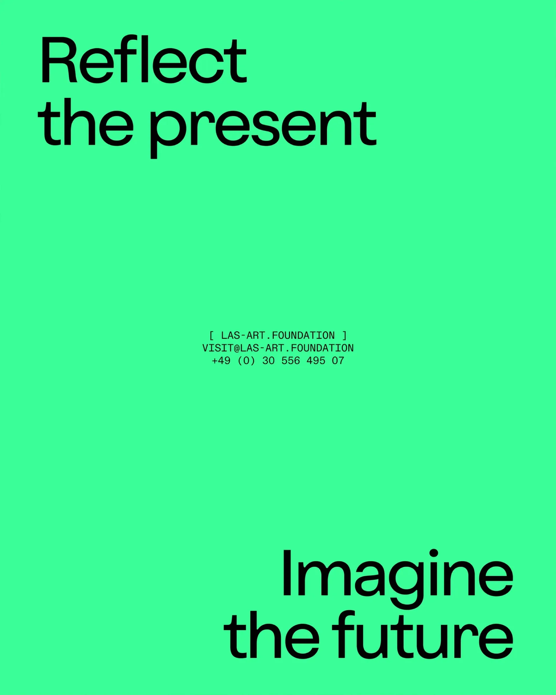
A detailed, dedicated brand observation and listening exercise. A new brand architecture and strategy. A visual identity transformation and a reimagined website. Our aim was to reflect the LAS Art Foundation's approach in their online presence: future-thinking, bold, flexible, and accessible.
As a nomadic Berlin-based art foundation who collaborates with artists to create large-scale art experiences both online and offline, we highlighted their nature of empowerment for artists by centring the artists they work with onsite and adopting concise communication throughout their platforms.
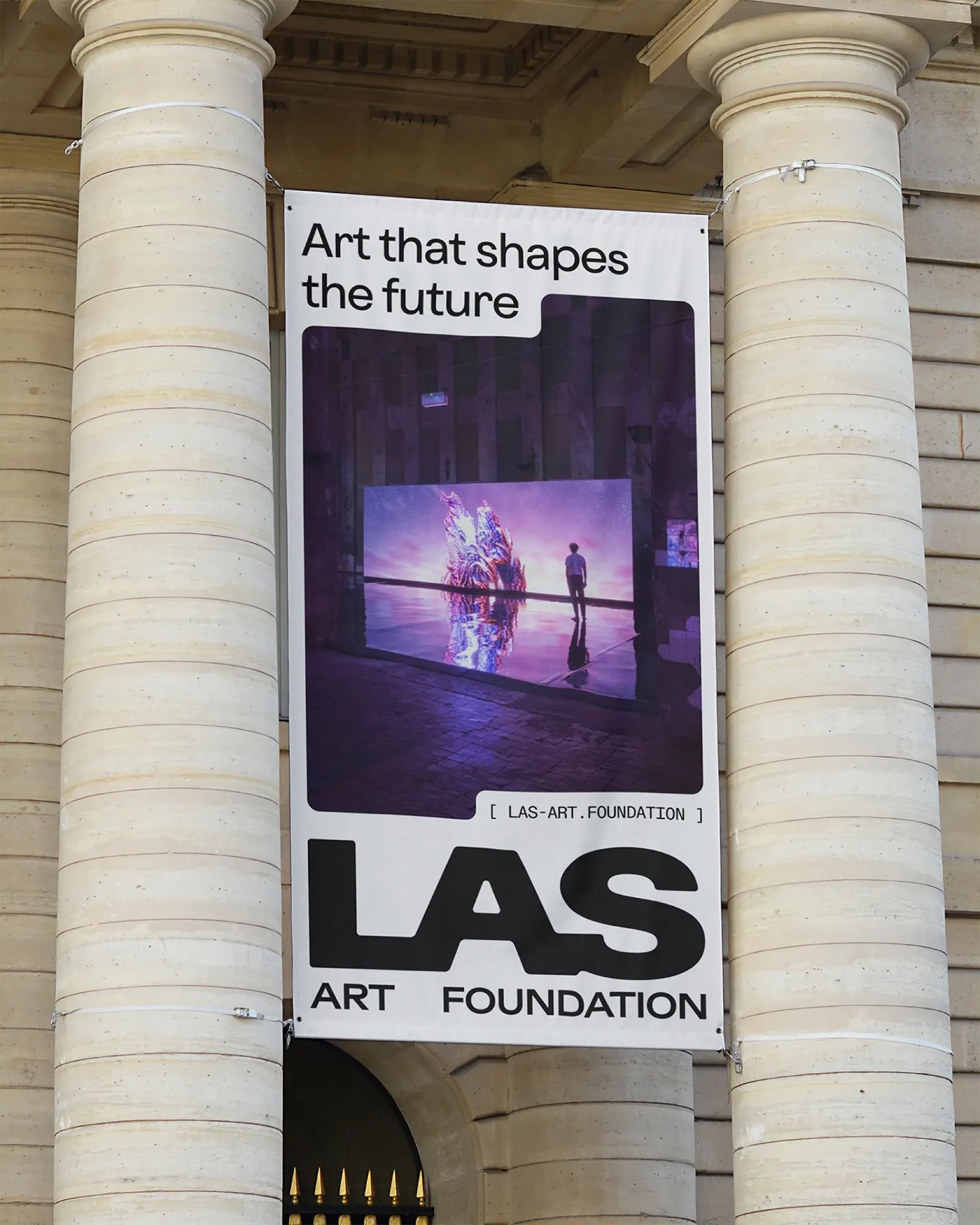
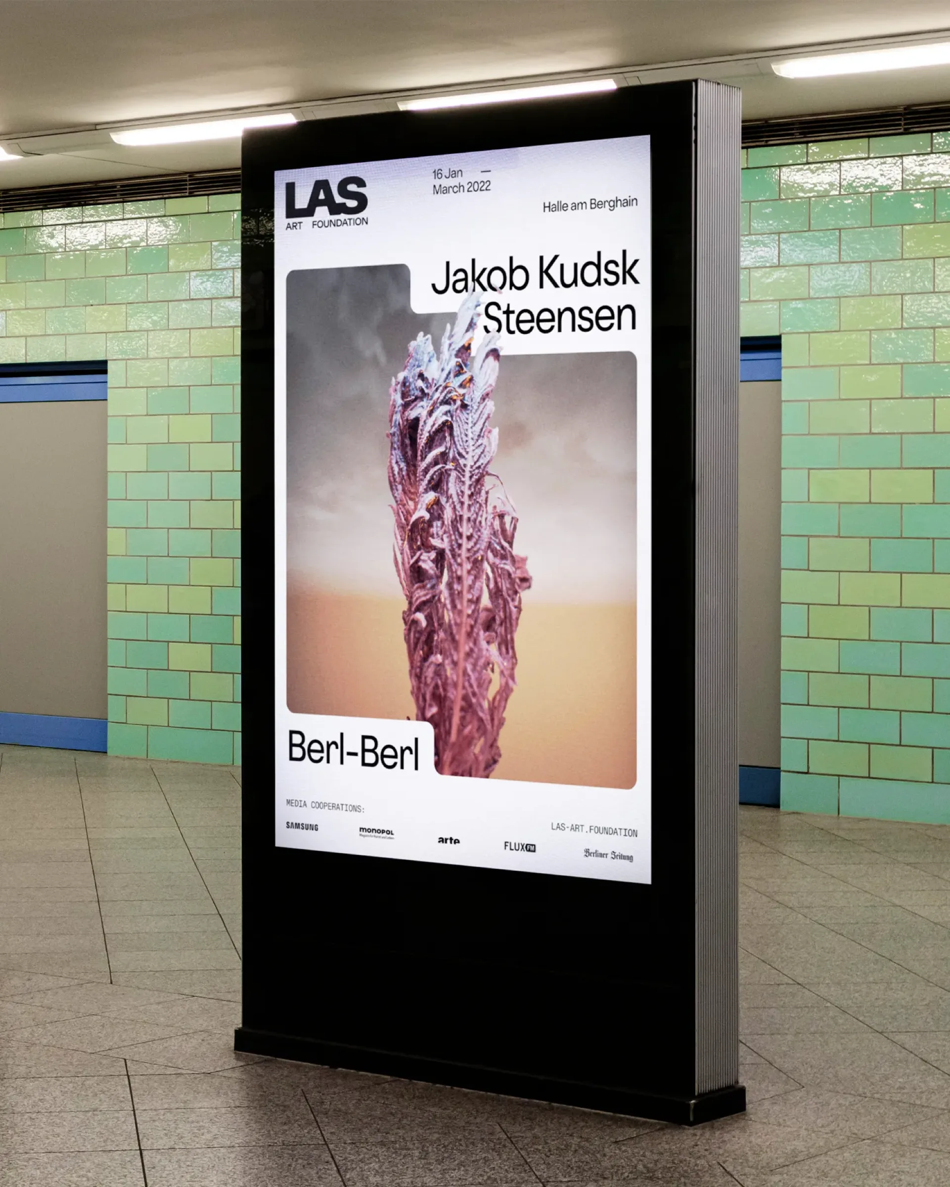
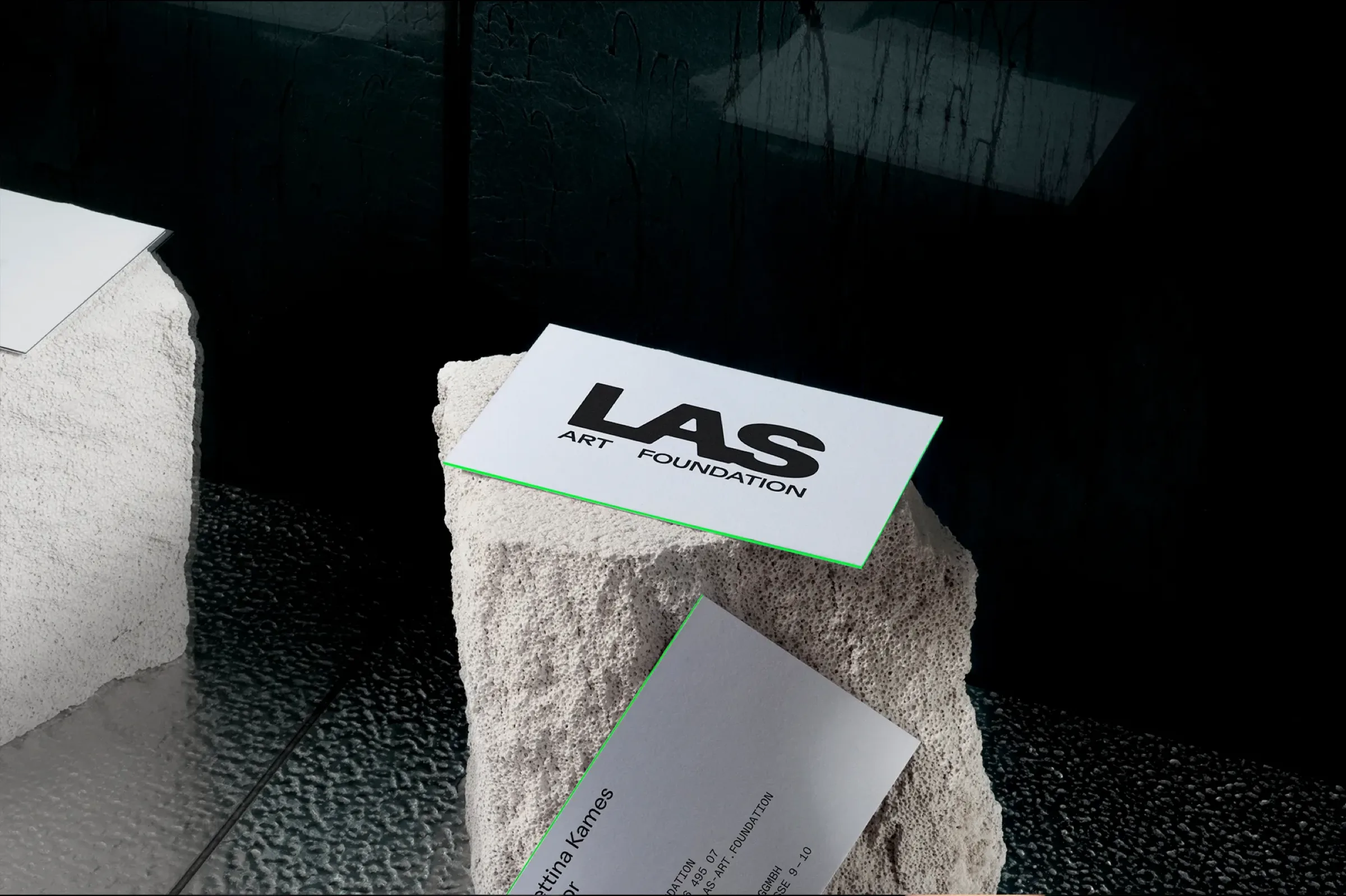
A new brand architecture built to travel with LAS across physical and digital spaces. The identity is set in Diatype by Dinamo and Oldschool Grotesk by Kilo Type, a typographic pairing that holds the tension between the institutional and the avant-garde.
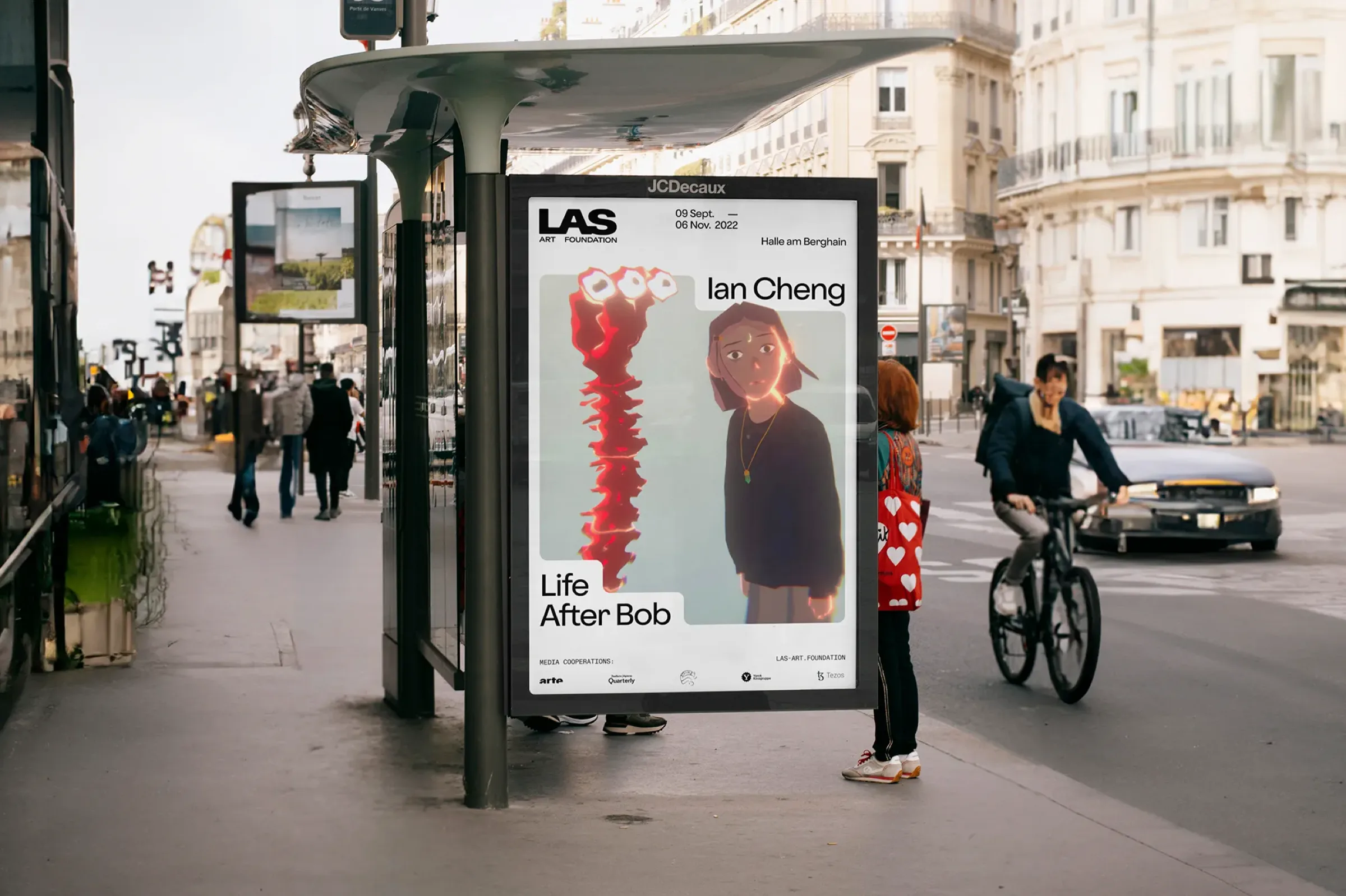
We developed animated poster systems, social media motion templates, and digital collateral that carry the new identity across all LAS touchpoints, from U-Bahn posters to Instagram stories.
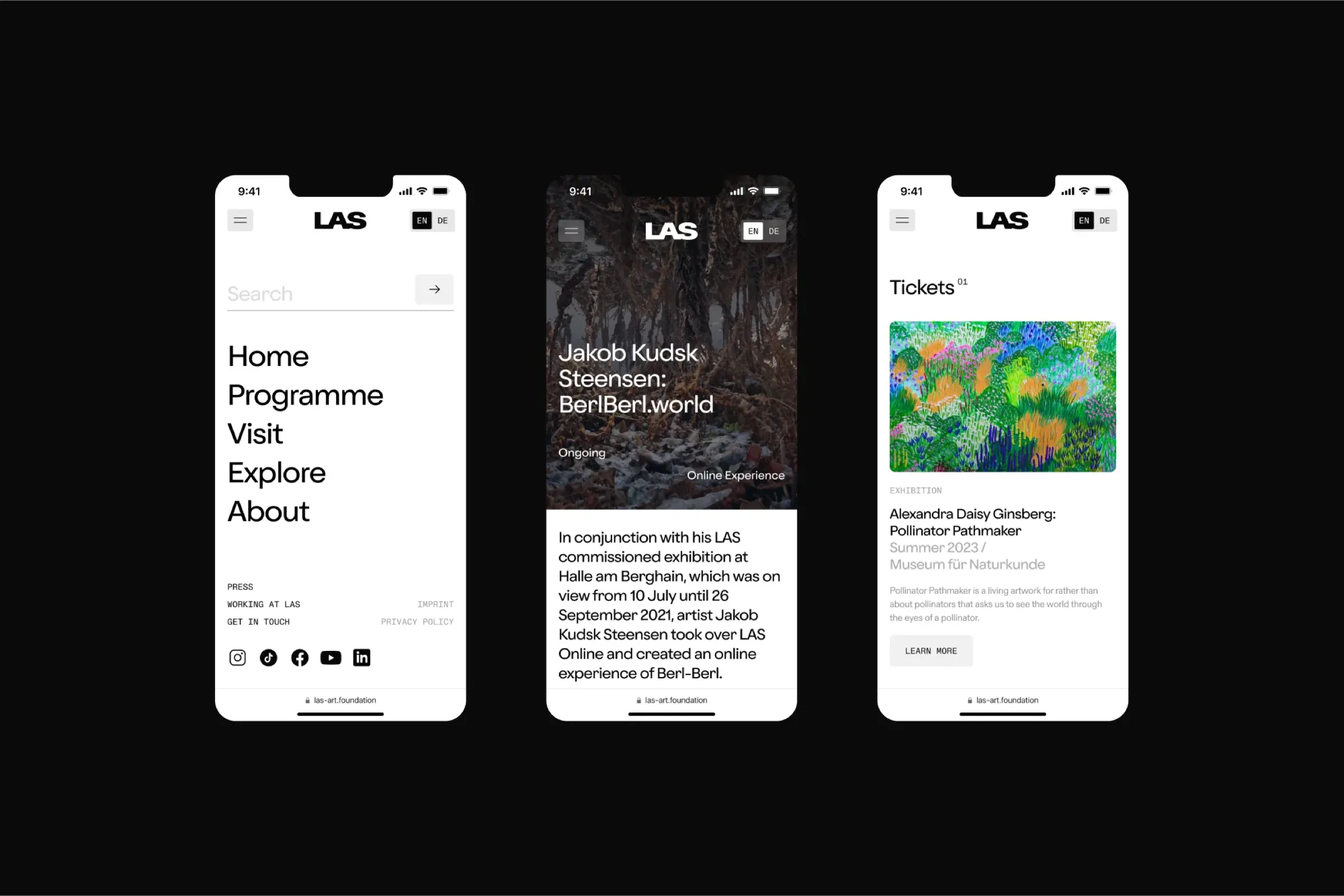
We developed the website using Vercel, Next.js and Sanity, allowing it to excel in both performance and content management. Interactive hover animations through the frame system ensure the website maintains consistency with the identity at every touchpoint.
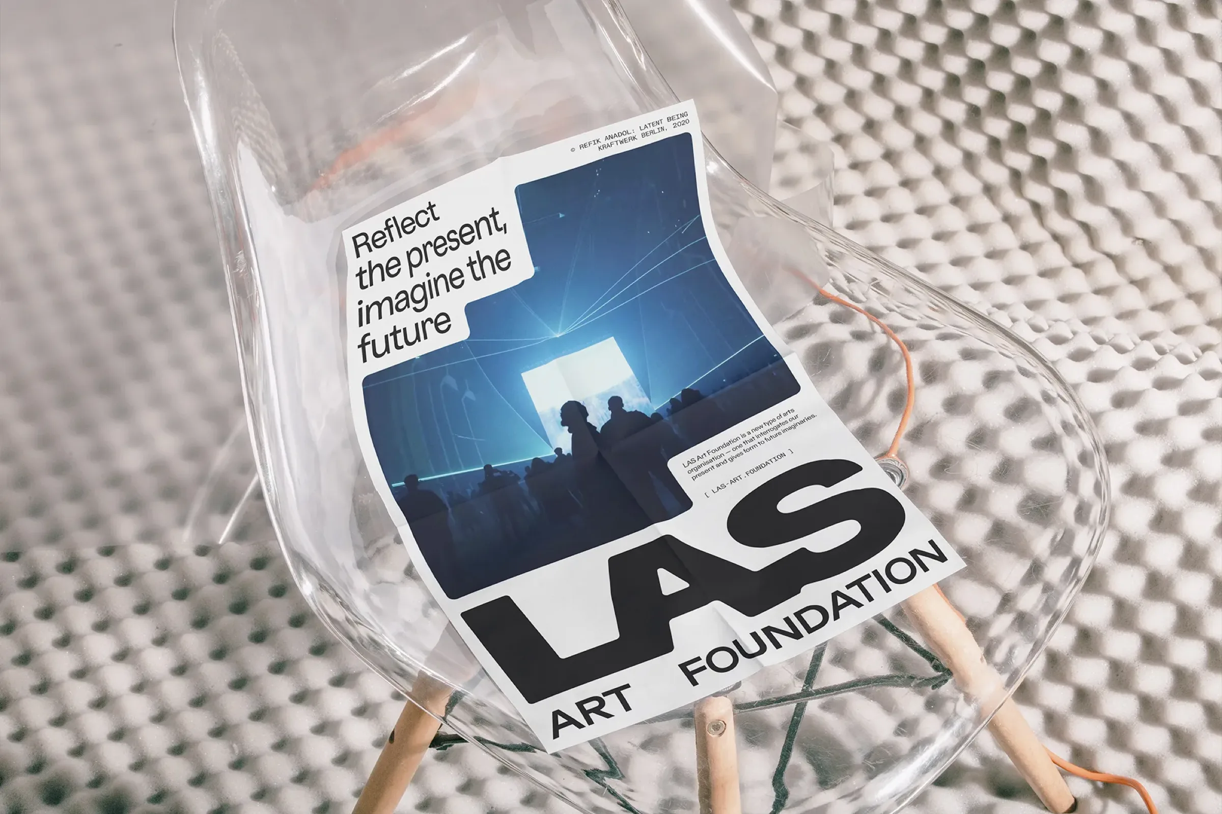
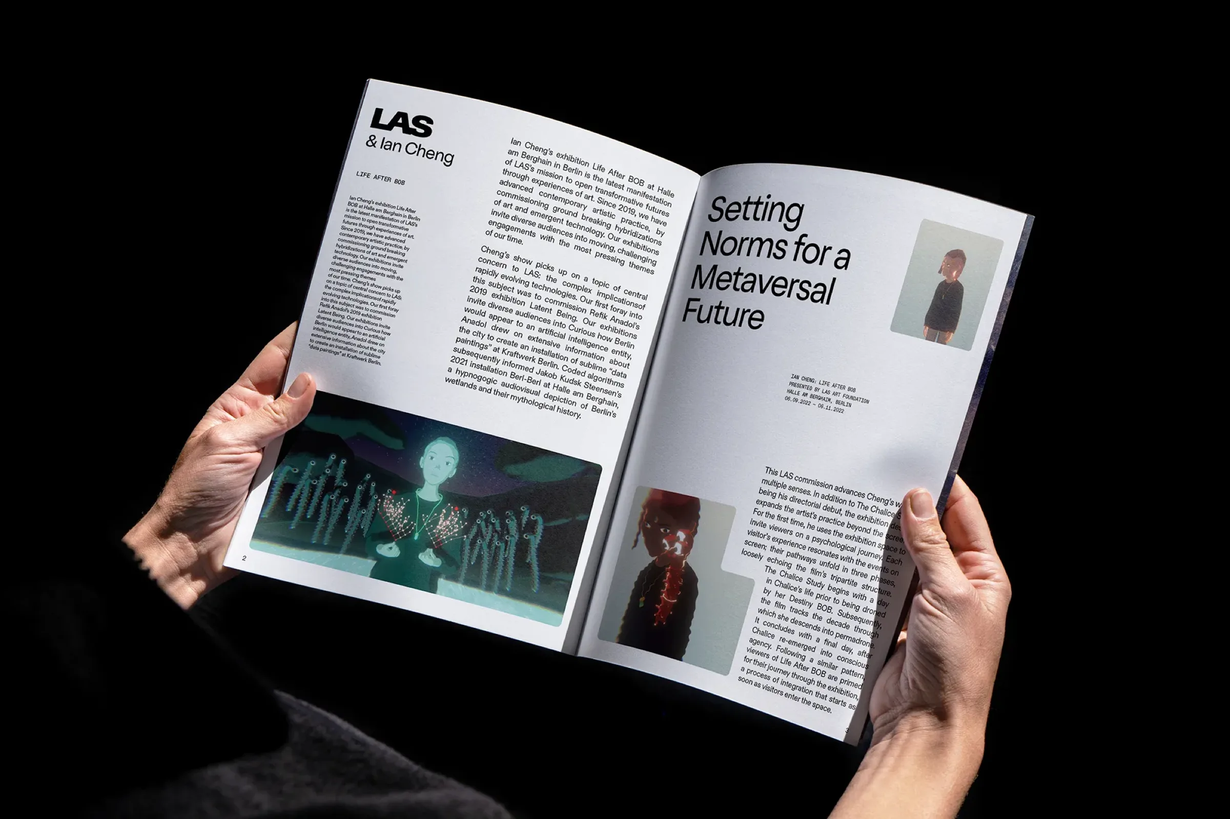
Comprehensive brand guidelines ensure consistency as LAS grows: covering typography, colour, motion principles, and application across print and digital formats.
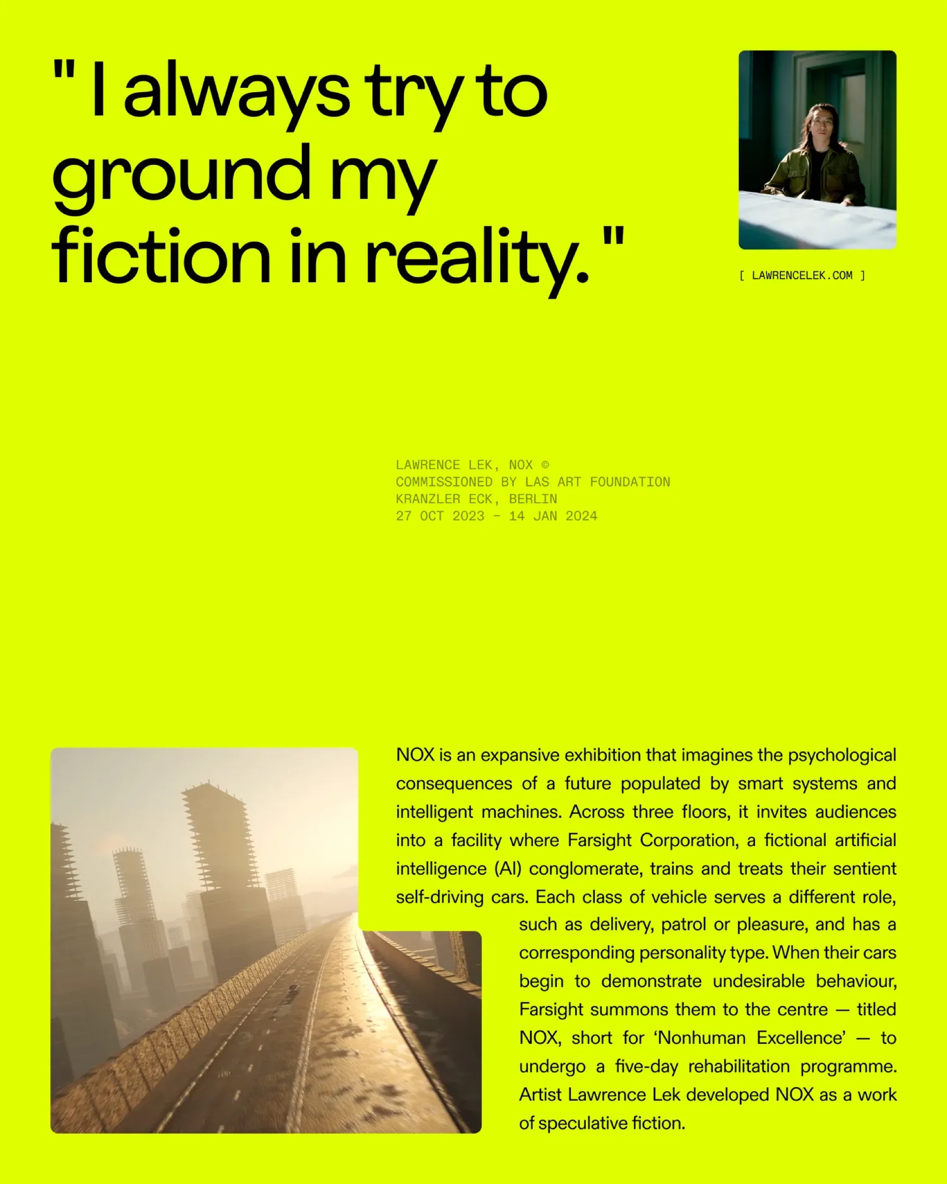
Centering the artists. Amplifying the work.
LAS Art Foundation is a nomadic Berlin-based art foundation that collaborates with artists to create large-scale experiences both online and offline. They came to us for a complete brand transformation: new architecture, new identity, new digital home.
Our aim was to reflect the LAS approach: future-thinking, bold, flexible, accessible. We centred the artists they work with: putting their faces and voices at the heart of every platform: while maintaining concise, confident communication throughout.